Clean Kangaroo
Product: On-demand laundry delivery mobile app
Role: User Researcher & UX/UI Designer
Responsibilities: UX research, wireframing, UI redesign, prototyping
Goal: Improve usability, visual clarity, and user trust while meeting client feature requirements
Outcome: Delivered a cleaner, more consistent, and accessible mobile experience aligned with client goals
Tools: Figma, Figma Make
Introduction:
This project focused on the UX/UI redesign of Clean Kangaroo, an on-demand laundry delivery app. The objective was to improve usability, visual clarity, and user trust while aligning with a predefined client feature list.
Through user research and iterative design, I delivered a modern, accessible mobile experience that balances business goals with user needs.
Design Process Quick Links:
Design Deliverables:
UX research insights and defined usability goals
Low-fidelity wireframes validating client feature requirements
Updated visual system (colour palette, typography, iconography)
High-fidelity mobile app mockups and interactive prototypes
Challenges:
Balancing business requirements with user-centered design decisions
Addressing trust and usability issues caused by an outdated interface
Improving the experience without disrupting familiarity for existing users
01 Research & Discovery Phase
To understand user pain points, industry standards, and business requirements to inform a research-driven redesign.
Main goals for the redesign were to:
Implement requested features from the client to enhance app functionality.
Update the visual design to create a more modern, clean look with improved accessibility.
Methods:
Conducted user interviews with 5 target users to identify usability pain points and trust concerns.
Performed competitive analysis to evaluate strengths and weaknesses of similar laundry or on-demand service apps.
Reviewed the client feature list to ensure business objectives were incorporated.
Developed a site map to define the app’s structure, feature placement, and user flow
Previous Design
New Design
Key findings and Insights:
Users found the previous app visually cluttered and outdated, making it difficult to navigate and trust the service.
Excessive colors, fonts, and dense layouts caused cognitive overload and reduced focus on key tasks.
Users wanted a minimalist, modern interface with clear hierarchy and professional aesthetics.
Competitive analysis highlighted common patterns in navigation, feature placement, and UI consistency that users expect.
Some user quotes:
"The app feels old and messy. I get lost easily, and it doesn’t look modern. I want an app that feels sleek and easy to use."
"I don’t trust apps that feel outdated. If I’m paying for a service, I want it to feel professional and reliable."
Competitive Analysis
Site Map
Design Decisions:
Adopted a calming blue-and-white colour palette to communicate cleanliness, trust, and clarity.
Updated typography to SF Pro Display, improving legibility and reducing visual overload.
Simplified layouts and added more white space to improve focus and scannability.
Standardised icons and UI patterns based on competitor insights to create familiarity.
Grouped related content to establish a clear visual hierarchy, enhancing usability and trust.
Custom Icon Design

Updated colour palette
Deliverables from this phase:
Key insights from user research
Site map defining structure and user flows
Recommendations for visual design, typography, and layout
02 Low Fidelity Wireframes
Objective
Translate research insights, site map, and client feature requirements into a clear, functional structure that sets the foundation for the final design.
Add Card Screen
Process:
Designed low‑fidelity wireframes to map core screens, interactions, and flows.
Integrated all seven client‑requested features to ensure full functionality:
Sign Up / Log In (email/password, Google + tutorial CTA)
Tutorial explaining the app in 3 steps
Payment card setup
Pick‑up/Drop‑off map
Laundry service selection with pricing
User profile (settings & logout)
Service history (current and past requests)
Validated structure and flow through early user feedback.
Applied usability and accessibility considerations to enhance clarity and ease of use.
Profile Screen Structure
Tutorial (3 Step) Screens
Service Status Screen
Service Request Screen
Outcome
A user-centered, functional blueprint that balances client needs, usability, and visual clarity, providing a strong foundation for high-fidelity mockups and prototypes.
03 Design
This phase focused on translating research insights and validated wireframes into a polished, production-ready interface. The goal was to create a visually consistent design that improves usability while supporting the client’s business requirements.
Prototype of the App Features
Design Focus:
Established a clear visual hierarchy to improve scannability and task flow.
Applied a calm blue-and-white colour palette to communicate cleanliness, trust, and reliability.
Used consistent typography, spacing, and components to reduce cognitive load.
Simplified interactions while preserving familiar navigation patterns.
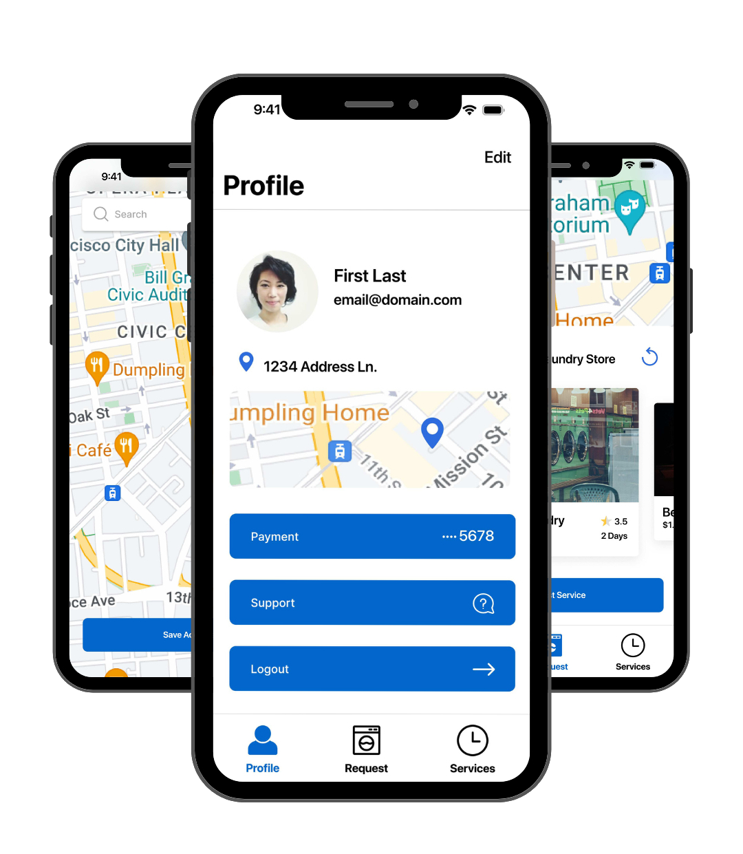
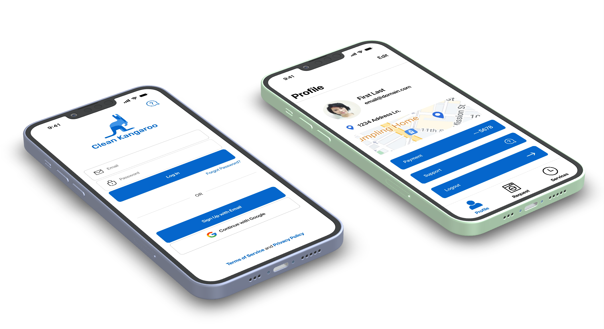
Profile Screen Mockup
Log In Mockup
Key Challenges & Solutions
Understanding users’ goals and pain points
User feedback highlighted issues around trust, visual clutter, and navigation. These insights informed design decisions focused on simplifying workflows, improving clarity, and providing stronger visual guidance across key screens.
Aligning the redesign with business objectives
The client-provided feature list guided prioritisation during the design phase. Core functionalities were designed to support key user actions while maintaining a clean and intuitive interface that encourages engagement.
Maintaining familiarity while improving usability
To avoid alienating existing users, core navigation patterns and functionality were preserved. Visual and interaction improvements were introduced gradually to feel seamless and intuitive rather than disruptive.
Tutorial (3 Step) Mockup
Final Design
The final UI delivers a modern, cohesive experience across key screens, including login, service selection, payment, address setup, and service status. Each screen was designed to minimise friction, guide users clearly through tasks, and reinforce trust in the service.
Service Status Mockup
Add Card Mockup
Set Pick Up/Drop off Address
Service Request Mockup
Outcome & Reflection
This redesign resulted in a cleaner, more intuitive experience that aligns user needs with the client’s feature requirements. By grounding design decisions in user feedback and prioritising clarity and consistency, the final solution balances business goals with a familiar, easy-to-use interface.
This project strengthened my ability to translate research insights into practical design decisions within real-world constraints.
What I Learned
How to balance client feature requirements with user needs without compromising usability.
How to simplify complex workflows and reduce cognitive overload through visual hierarchy and spacing.
The importance of building trust through UI design elements (colour, typography, consistent icons).
How to translate research findings into actionable wireframes and high-fidelity designs.
How to preserve familiarity for existing users while modernising an interface.